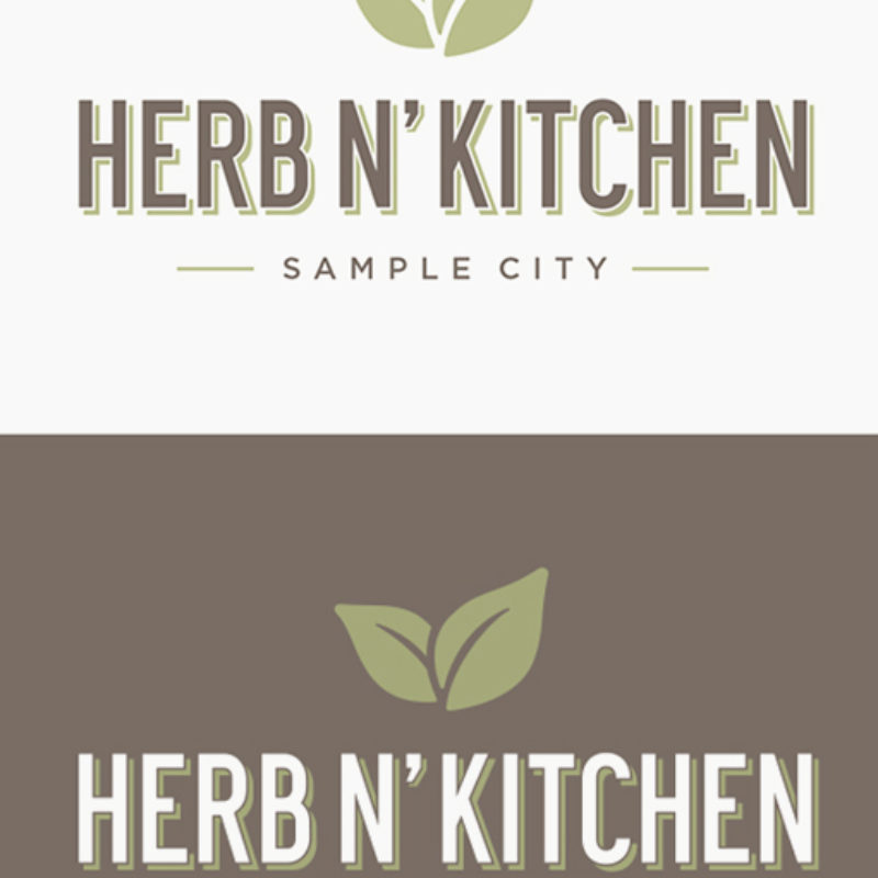
Logo
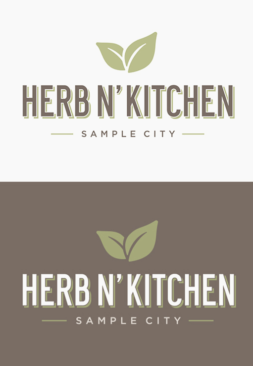
PRIMARY LOGO
The logo can be reproduced on any solid background but should always maintain the color palette. Lighter or darker backgrounds work better. Each HNK location is branded with its “city” tagline as an integral element of its identity. This strengthens the HNK brand and should never be dropped or separated from the logo.
MINIMUM SIZE
To ensure the clarity and legibility of the logo, the minimum size of the in print applications is 1.65” wide. In certain applications smaller sizes may be necessary. In such cases legibility should always be the top priority—use a 1 color or black logo.
CLEAR SPACE
The clear space is defined by the measurement “x” which is the height of the “Herb N’ Kitchen” text. The minimum amount of clear space required on each side of this signature is ¾ x. Whenever possible, it is recommended to have 1½ x to ensure the logo

